In a few seconds of landing on your website, your potential customers have already had their first impression of your company. Your home page is like your home entry door, visitors do not stay there for long, but they expect it to be cleanly kept, and welcoming. Let’s see what do you need to create great home page content?
Keep in mind, attention span is short.
Your home page content needs to give them a clear sense of who you are and what you do and invite them to explore additional pages, learn more about your services. If your page is not what they expected and do not have a clear message, they will leave immediately.
What should powerful home page content include?
The homepage is to grab attention, warm up your audience, take them on a user journey, to create credibility so at the end of the page your visitors trust you and will be ready to take action.
People find it easier to talk about the different services they offer, but if you offer more than one service, then the homepage is not the best place to go into details. You will have plenty of space on the services pages to explain what you do.
Here are a few key things to make your homepage better.
1. Know your primary audience
It sounds simple, but many business owners do not have a defined audience in mind. So ask these questions first.
- Who is your primary audience?
- What about the secondary audience?
- Where do they hang out?
- What kind of help are they looking for?
- What kind of information do they need?
- How will you reach them?
If you are able to answer these questions, that helps you to figure out what content and messages your audience will care about. Once you know your audience, it is easy to connect with them.
(Marketing Evolution has a great article on why it is important to decide your target audience)
2. Start with a Winning Message on the top
You can have the sleekest, most stunning website design, but if visitors can’t understand what you do within seconds, you’re going to lose them. Your top message is the attention-grabbing topic that makes them stop scrolling and pay attention to you.
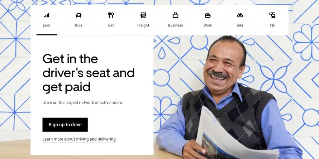
Take a look at this header. Uber’s website is very clear about what it can do for people who are looking for work. The drivers are the main target, they can get all the information within reach from the top section of the website.

3. Include a Value Proposition
The value proposition is a statement that explains why people should choose your service over that provided by your competitors.
This should identify all the benefits that your services or products offer and describe what makes those benefits valuable. It should be easy to understand, define what you do, make it clear who you want to work with, and explain how you solve their problem.
4. Explain what problem you solve
Knowing your target audience, you will understand the problems they face. Being specific about what problem your product/service solves for them helps too.
Like:
Outdated old website? – We provide modern, user and mobile-friendly websites for local businesses.
Great website but no traffic? – We can improve website visibility with search engine optimization.
Need Google Business Listing? – We can help with GMB optimization.
5. Tell them why they should choose you
There are very few businesses that do not have fierce competition. Tell visitors what sets you apart and why they should use your service instead of the other guy’s similar one. Be more accurate than, “We have the best people” or “We have the most efficient process”. Make it clear what makes you different, and be specific.
6. Give evidence that your service works
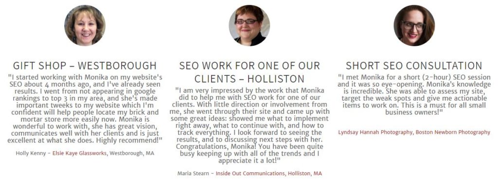
People trust real people. Show them customer success stories. Be short and specific.
You can grab a couple of testimonials from your Google Reviews and add them to your home page. I prefer adding testimonials spread out across pages, rather than dedicating a page solely for them.

If you can, add names, companies or, logos to strengthen your credibility.
7. Use Keywords
Search engines look for keywords to determine where to place you in their directories or listings. Make sure your home page content includes words associated with your business and more importantly that your prospect is likely to use looking searching for help.
You need words and the right words.
Search engines do not care about your website layout, or background color, or images. Therefore some professionals, like photographers have a hard time ranking their websites, which are full of images, but lack words.
A search engine-friendly home page needs a keyword-rich content copy.
8. Action Button / Calls to action / CTA
The goal of your website is to get visitors to take action. The best way to create buttons using action verbs like, Buy Now, Sign Up, Download this, or that.
9. Mobile-friendly navitation
Make your website mobile-friendly, and easy to navigate. Your visitors should be able to instantly determine where to locate the information they need. My approach to home page design is to add as much info as possible to the home page. Mobile users scroll up and down easily, but it is harder for them to click on the menu on the top.
The home page should promote your inner pages with easy hyperlinks or buttons.
10. Add images to grab attention
Images reinforce the message. Have you heard that “an image is worth a thousand words”? Most of the time visitors do not read all the words but scan the page to look for clues. Therefore it is good to use images. Visitors can emotionally connect to images and that is what makes it so powerful. Unique images grab attention easier than words.
Latest Blog Posts
- What is Browser Cache
- What to do with no-index pages in Google Search Console
- Understanding no-index page in the Search Console
- Massage Therapy Website Design
- How Much Does a WordPress Website Cost?

